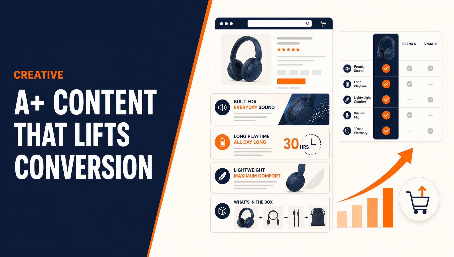
The Three-Section Framework Behind Every High-Converting Layout
The highest-performing A+ layouts we build follow the same underlying sequence regardless of category.
The top section, typically the first one or two modules, handles emotional connection. This is where a bold hero image, short value-proposition headline, or brief video answers the shopper's first unspoken question: what problem does this solve for me.
The middle section handles logical justification. Feature breakdowns, specifications, and comparison charts answer the next question: why this product specifically, out of every option on the search results page.
The bottom section handles decision confidence. Q&A modules, cross-sell content, and brand story elements answer the last question before checkout: why this brand, and why trust it enough to complete the purchase.
Skipping straight to specifications without the emotional opener, or ending on features without a confidence-building close, is the most common reason a well-designed A+ page still underperforms.
Pattern 1: The Above-the-Fold Value Proposition Hero
The first module a shopper sees should lead with the value proposition, not the product name they have already read in the title. A short headline stating the core benefit, paired with a full-width lifestyle or hero image rather than a plain white-background product shot, sets the tone for everything below it.
On mobile, where over 60 percent of Amazon purchases now happen, this module often loads immediately below the price and before the bullet points. For most shoppers, this hero is the actual introduction to the product, not a supplementary add-on to a description they have already read.
Pattern 2: The Comparison Chart
Across every category we have tested, the comparison chart is one of the two most consistent drivers of conversion lift, alongside lifestyle imagery. For catalogs with multiple variations, sizes, or complementary products, a clear side-by-side chart helps the shopper self-select the right option in seconds instead of bouncing between listings to compare specs manually.
Beyond the direct conversion lift, comparison charts measurably reduce returns, since shoppers arrive with accurate expectations about what they are buying instead of guessing between similar-looking options.
Pattern 3: Lifestyle Imagery With Hotspots
Static lifestyle photography earns its place by showing the product in actual use rather than isolated on white. Premium A+ takes this further with interactive hotspots, small tappable points on a lifestyle image that reveal feature callouts without cluttering the visual with text overlays.
This pattern works because it removes a barrier that is unique to online shopping: the shopper cannot touch or hold the product. Hotspot imagery answers dimension, material, and use-case questions inside the same visual the shopper is already looking at, instead of forcing them to scroll to a separate specs module.
Pattern 4: The Brand Story Carousel
Brand Story is a separate carousel module that sits above A+ Content on the product page and is reused across every ASIN under the brand, distinct from the per-ASIN A+ modules themselves. It carries brand identity and cross-sell, while A+ Content carries the product-specific evidence. Publishing both together is what unlocks Premium A+ eligibility in the first place, and the two work best as a pair rather than either one standing alone.
For premium-priced products and newer brands where shopper trust is the main barrier to purchase, leading with a short provenance story, founder background, or ingredient origin before the product-specific evidence modules tends to outperform jumping straight into features.
Mobile-First Rules That Actually Move the Number
- Design at 2x resolution and export at Amazon's module requirements so images hold up on Retina displays.
- Compress every image to under 500KB so mobile load times do not stall the page before the shopper scrolls to the modules that matter.
- Use full-width modules over multi-column layouts, since multi-column designs that look clean on desktop compress into unreadable text on a phone.
- Keep text overlays minimal and let the imagery carry the message. A module that needs a paragraph of on-image text usually needs a redesign, not a smaller font.
Measuring the Lift Correctly
The honest way to measure A+ Content impact is a SKU-level conversion rate comparison, run for at least 30 days before publish against at least 30 days after. Crediting a conversion lift to the whole catalog after publishing A+ across a batch of ASINs almost always overstates the picture. In practice, the lift tends to concentrate in a handful of SKUs while others see flat or marginal gains, and without per-SKU measurement it is easy to miss which listings are actually doing the work.
| Category Type | Typical Lift Size |
|---|---|
| Discovery and considered-purchase (home, beauty, supplements) | Largest absolute lift |
| Multi-variation or comparison-heavy catalogs | High, driven mainly by the comparison chart |
| Commodity categories with strong price competition | Smaller, more incremental lift |
| Self-explanatory, low-consideration products | Lowest expected lift |
Mistakes That Cap Your Conversion Lift
- Leading with specifications instead of the value proposition, which skips the emotional opener a shopper needs before logical detail lands.
- Text-heavy modules built for desktop reading, which get skimmed past entirely on mobile where most traffic actually lands.
- Skipping the comparison chart on a multi-variation catalog, leaving the single highest-impact module out of the layout.
- Treating every ASIN as equally worth the investment instead of prioritizing hero ASINs and considered-purchase categories.
- Submitting content with promotional claims, competitor mentions, pricing or shipping language, or unverifiable statements, the most common rejection reason, which can add up to seven business days of delay.